Designing Musico: From Idea to a Live Product
Musico is an all-in-one platform designed to help music schools and teachers provide extraordinary teaching experiences. Over 4 years as the sole designer, I was responsible for every layer of the product — from early ideation through to a live product with real customers across the US and Europe. This included the product itself, the design system, marketing materials, and ongoing usability testing with real users.

My Role
Sole designer across the entire product. UX research, design systems, product design, brand, and marketing.

Device
Web · Tablet · Mobile
-
2018-2022

Impact
2K weekly active users
The Studio:
A Lesson Builder for Every Teacher
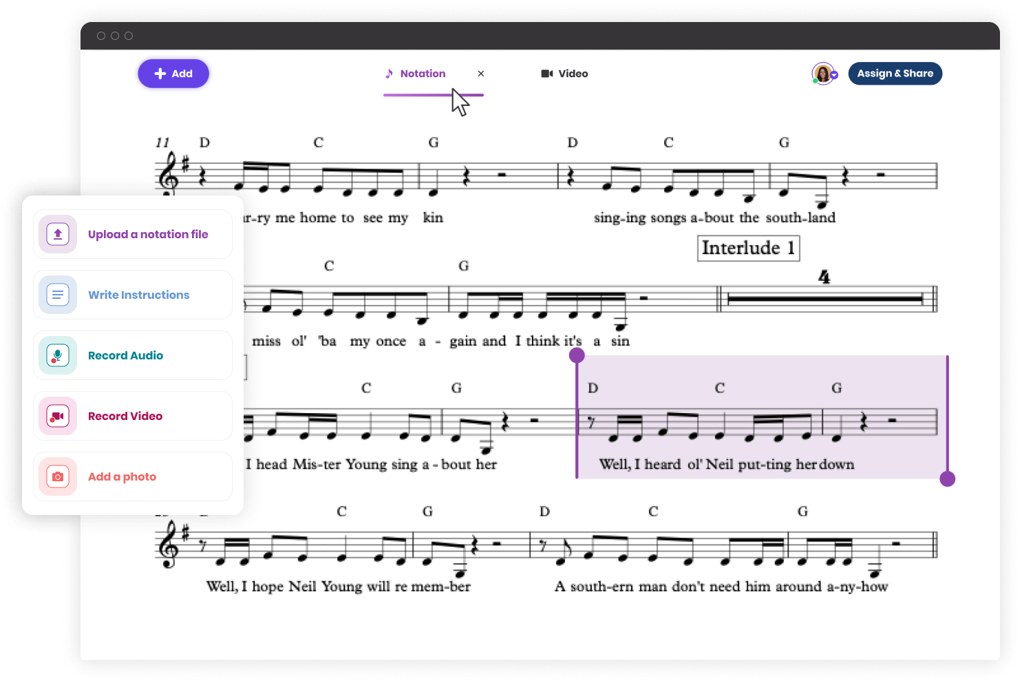
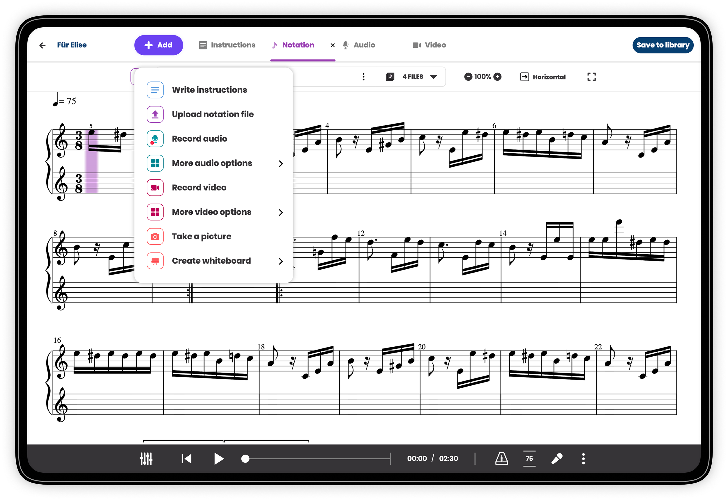
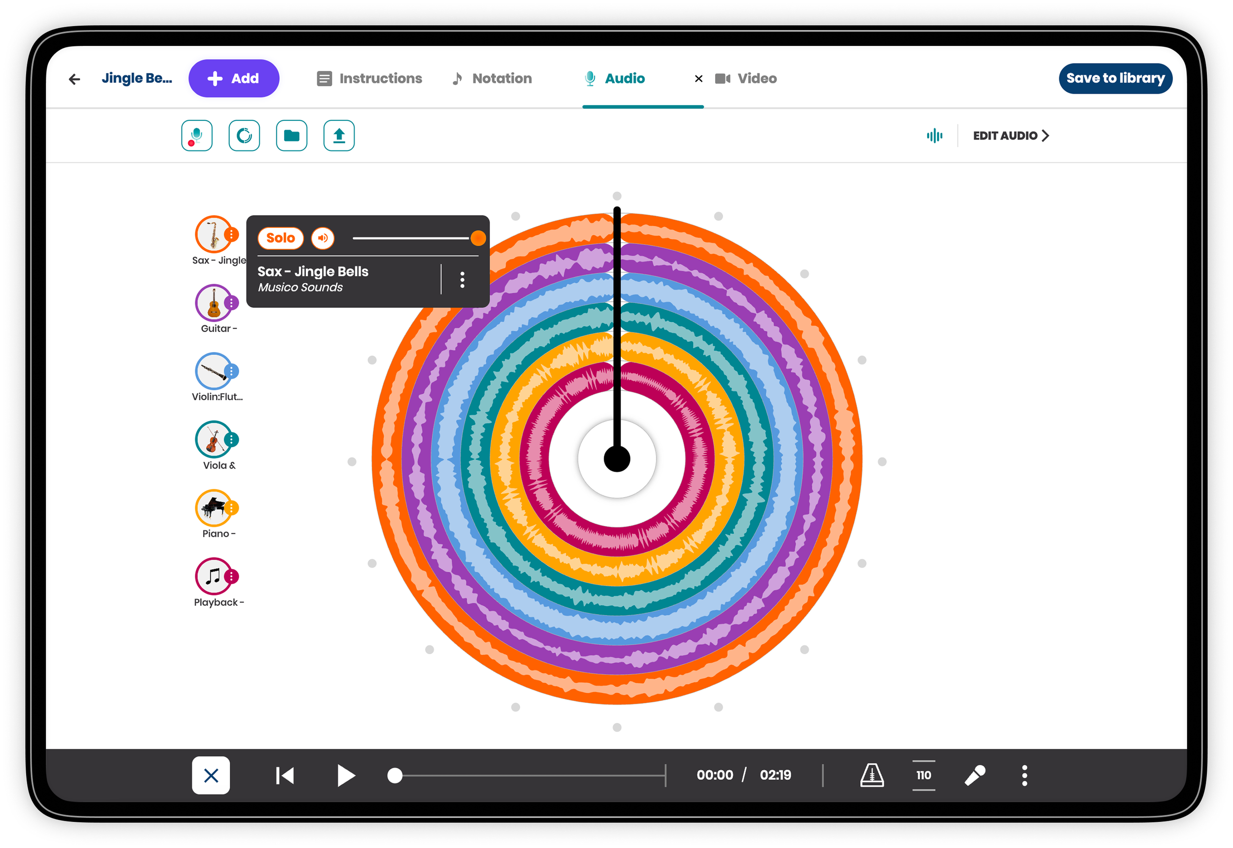
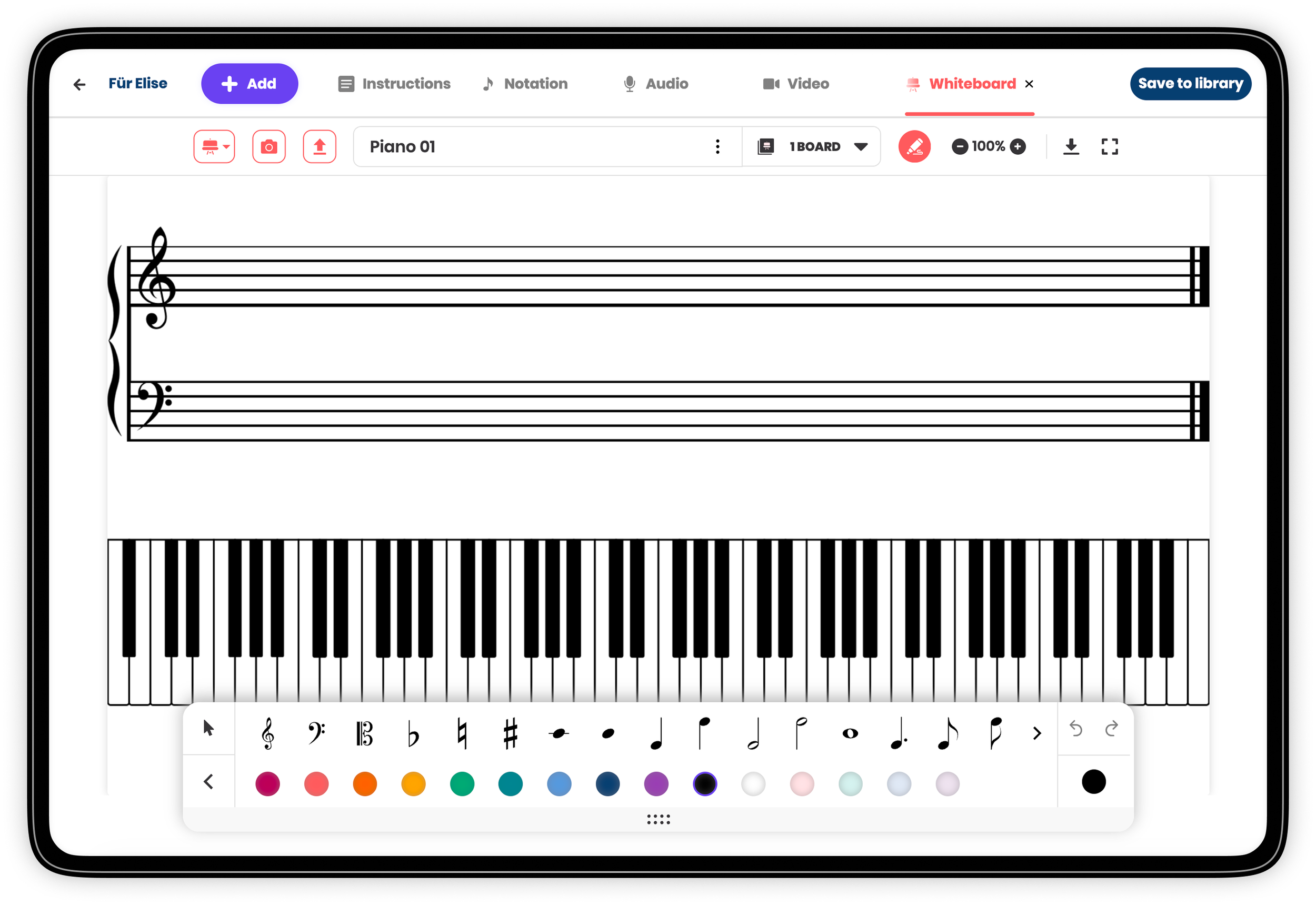
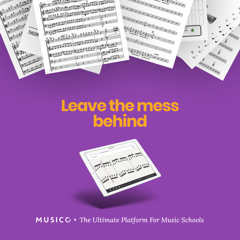
The Studio is Musico's lesson-building tool — a modular canvas where teachers create and share teaching units composed of up to five content types: written instructions, sheet music, audio recordings, video, and an interactive whiteboard.
The design challenge was significant: a lesson can be as simple as a few written instructions, or as rich as a full package of notation files, audio channels, instructional video, and worksheet templates. The Studio had to support both use cases equally, without making either feel like a workaround.
The bigger challenge: Musico serves music teachers across completely different instruments: guitar, drums, trumpet, piano — each with their own materials, workflows, and expectations. The system needed to feel tailored to each of them, while being built from a single shared architecture.
My approach was research-driven from the start. I worked closely with teachers from the US and Europe — observing how they built lessons, understanding their workflows, and testing assumptions in real time. That research shaped every decision about the building blocks: what each content type needed to support, how much flexibility to allow, and where structure was actually helpful.
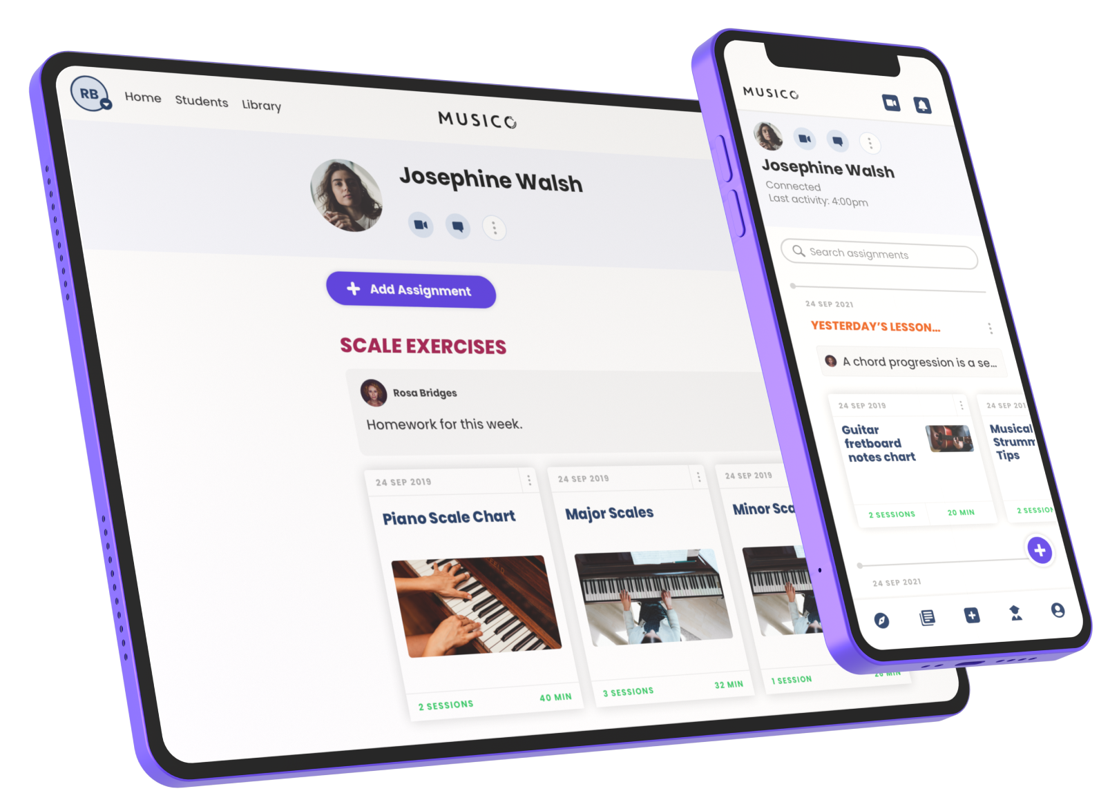
The Notebook:
A Student's Learning Timeline
The Notebook gives students a single place to track all their assignments and progress over time — organized by topics, searchable, and accessible on any device. For teachers, it's a tool for organizing assignments, adding notes and weekly practice tips, and tracking student engagement through practice time and session data.
Before Musico, teachers sent resources by email or SMS, students lost their notebooks, and there was no way to detect when a student was struggling. The Notebook replaced all of that with a structured, persistent, and shared learning record.
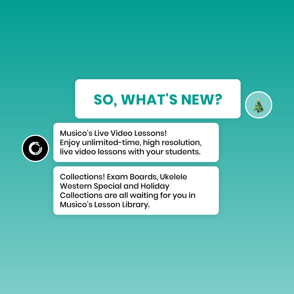
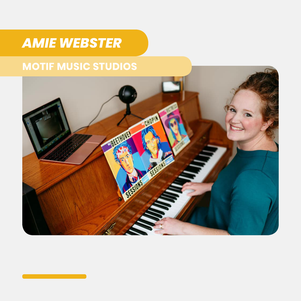
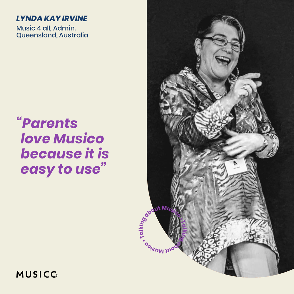
Marketing Design
As the sole designer, my work extended beyond the product. I was responsible for all of Musico's visual output — campaign ads for Facebook and Instagram, social media templates for product updates, testimonials, and seasonal campaigns. Working closely with the Head of Marketing, I developed visual concepts and ad variables for each campaign, translating product messages into Musico's colorful, approachable visual language.


Research & Usability Testing
As the only designer in a small team, UX research was part of my role from day one. Every 4 weeks, at the end of each iteration, I planned and conducted usability tests with real users — teachers and music school owners from the US and Europe, both online and in person. The process was structured: set goals, write a script with 2 core tasks, prepare mockups, schedule 20-30 minute sessions, record everything, find patterns, and iterate.
Interview data also revealed an important insight: tablets were the most accessible device for students during lessons. This shaped how we prioritized the tablet experience throughout the product — it wasn't an afterthought, it was a core design constraint.
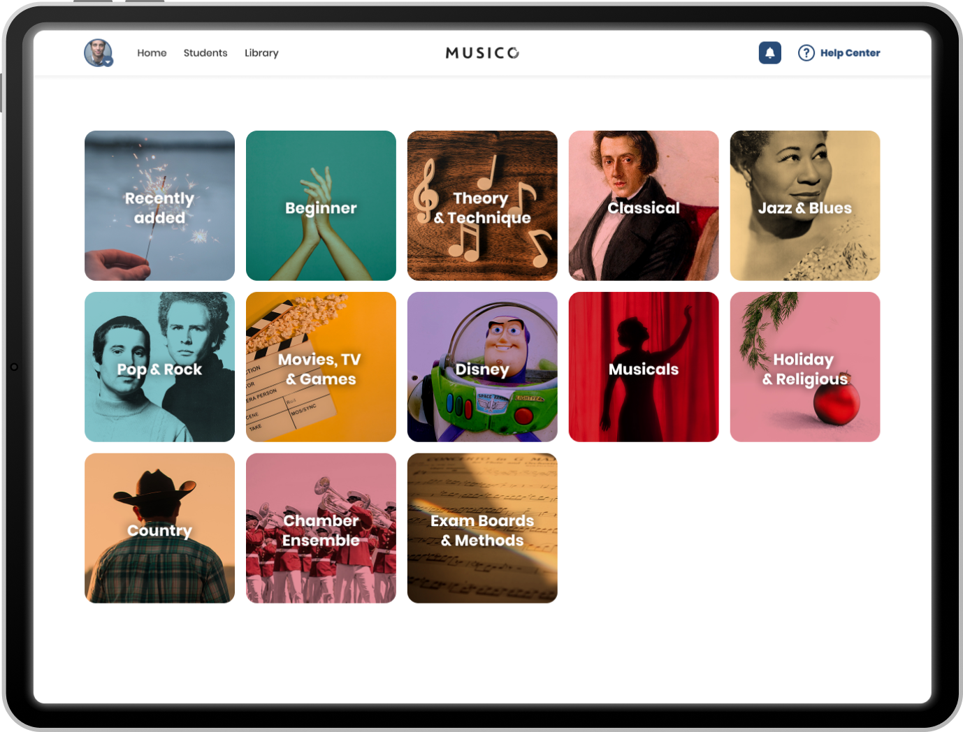
One test reshaped how we thought about content discovery. Our original assumption was that teachers would prepare lessons in advance — sitting down before class, browsing Musico's library, and selecting what to work on. Based on that, we designed a rich, Netflix-style homepage with carousels across multiple categories, built for exploration.
Interviews told a different story. Teachers didn't want to spend personal time outside of work hours on lesson prep — and many actually preferred involving their students in choosing songs, as a way to spark excitement and motivation. The browsing happened during the lesson itself, with a student sitting right there.
That insight completely changed the direction. Instead of endless carousels, we introduced a focused category screen as an entry point — giving teachers the richness of the full library, but in a format that made selection fast, fun, and collaborative. The exploration experience was still there, just designed for a two-minute moment in a lesson, not a quiet evening at home.